I'm Hillary Grant, a graphic designer based in Seattle.
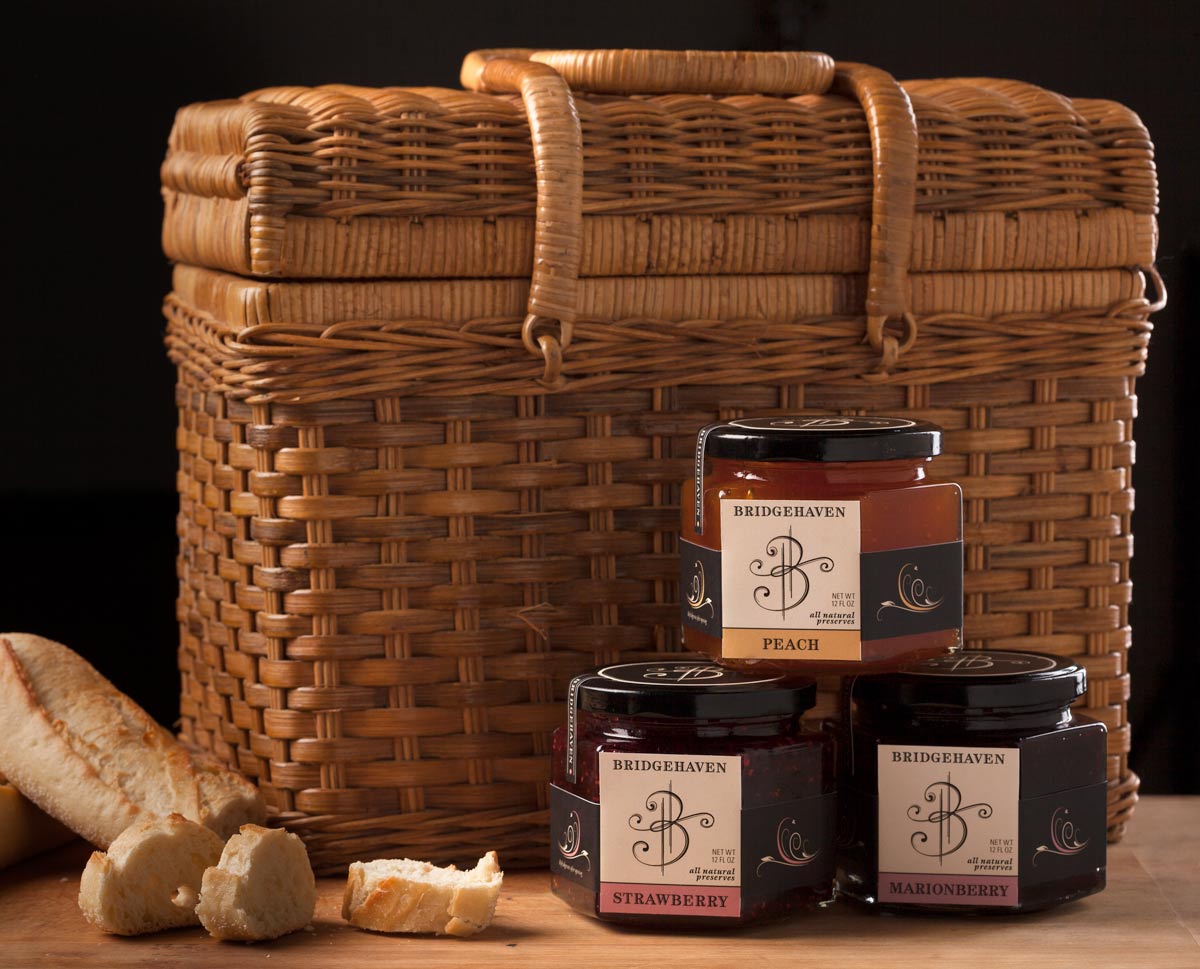
Bridgehaven Preserves
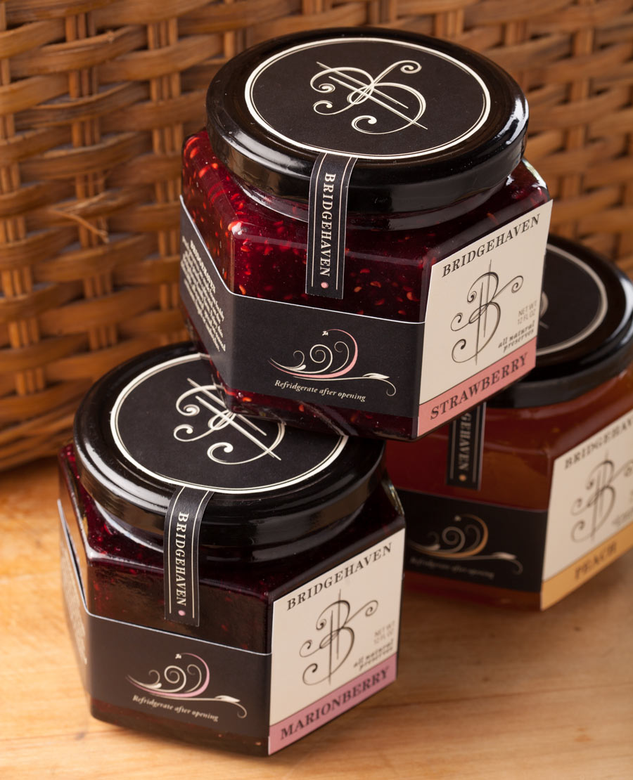
packaging
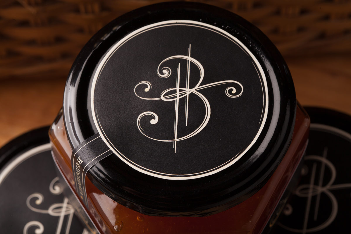
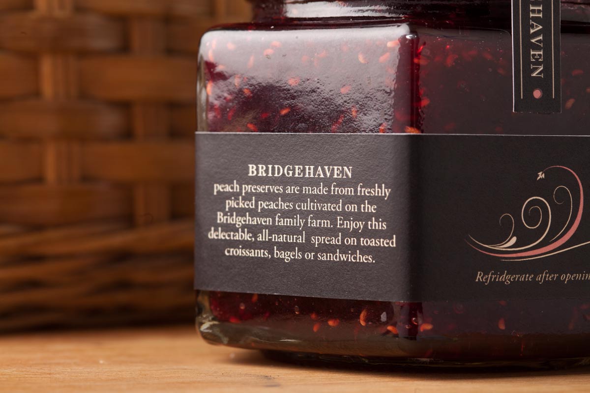
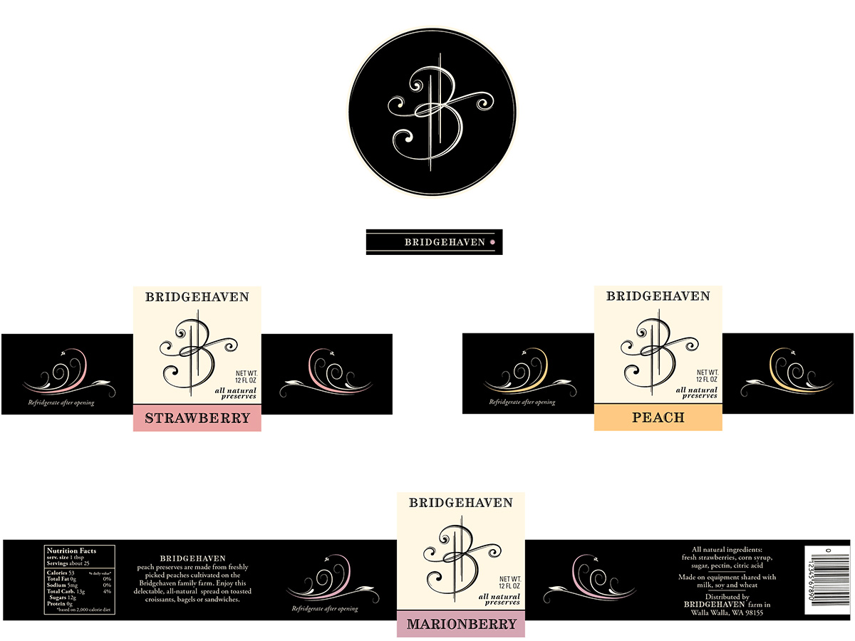
This packaging project involved designing a logo and brand that would stand out on a store shelf, creating a dieline for a uniquely shaped jar, and working within typographic requirements for food labels. I chose elegant, rich black in combination with a warmer natural cream as the basis for the product identity, allowing the inviting colors of the fruit type to stand out. Organic thick and thin lines in the logo and side panel flourishes create perceived value and tell the buyer that this is a special product worth a higher shelf price.