I'm Hillary Grant, a graphic designer based in Seattle.
Seattle Sockeye
branding, web design
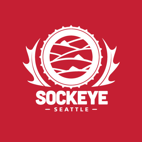
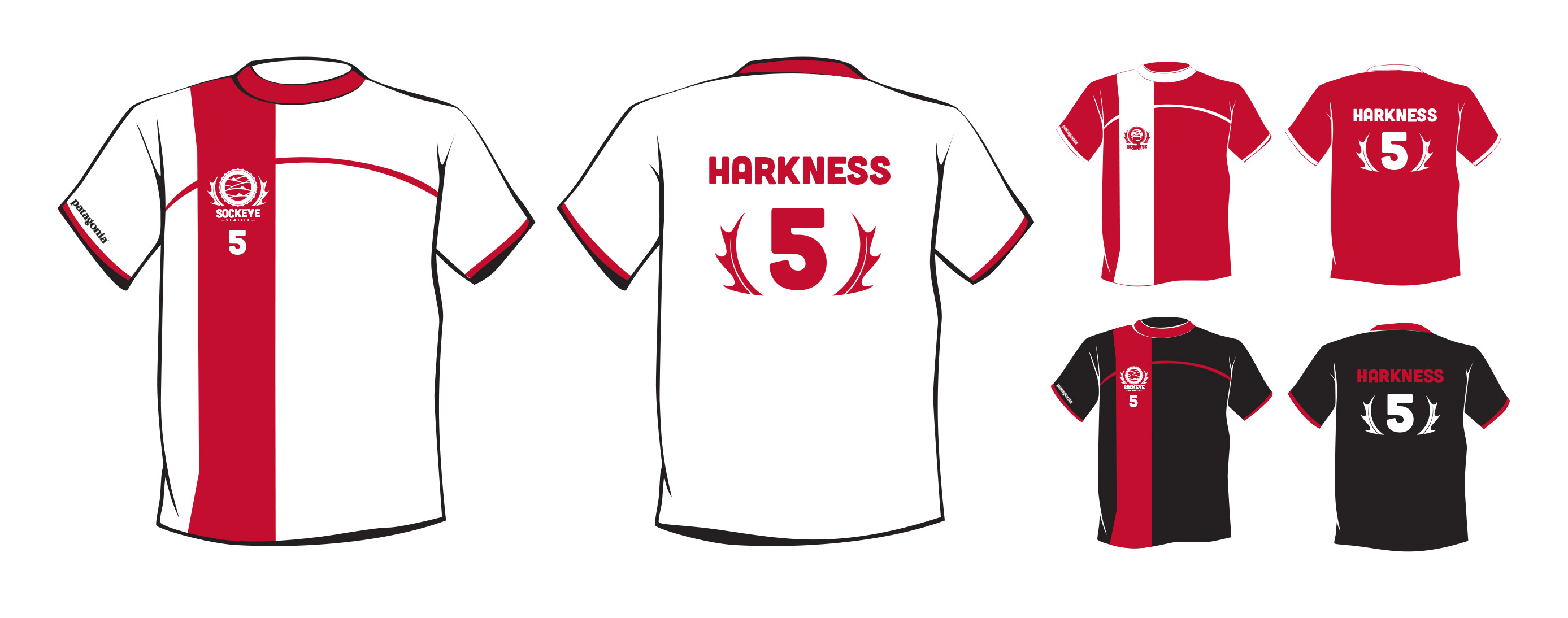
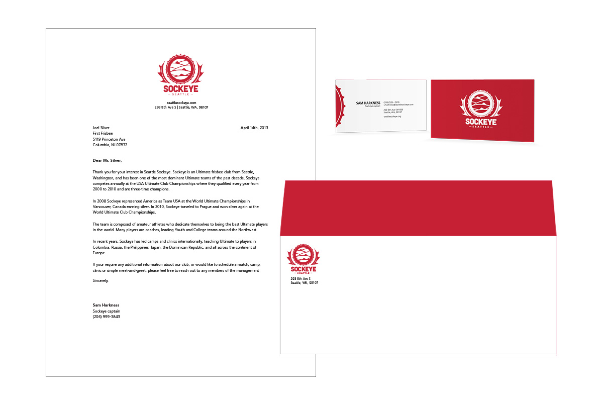
This project for Seattle’s top men’s ultimate frisbee team required an updated logo and identity that captured the athleticism and spirit of the game, appealed to an international audience, emphasized teamwork, and still conveyed that “the Fish” were guys you’d like to have a beer with after a match.
I looked to international soccer team logos for inspiration, and chose a circular emblem style to hint at a frisbee, rather than show a disc directly. I focused on an abstracted school of fish to emphasize Sockeye’s core values and key characteristics of the sport.
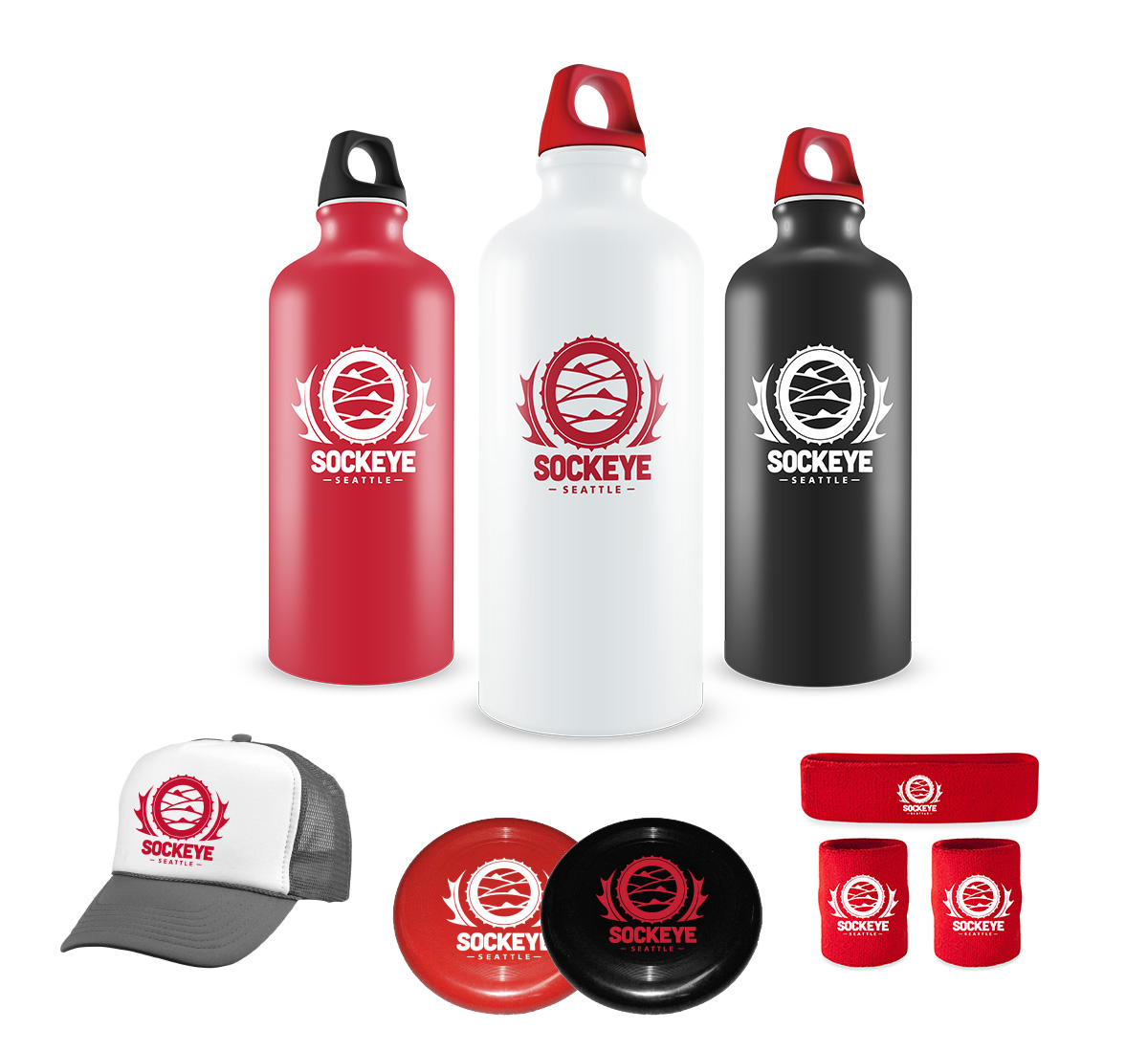
One of my favorite aspects of the logo is the spiked circle which doubles as the top-down view of a beer cap. It isn’t noticeable to younger fans, but is something the team and other “in the know” adults can still enjoy.
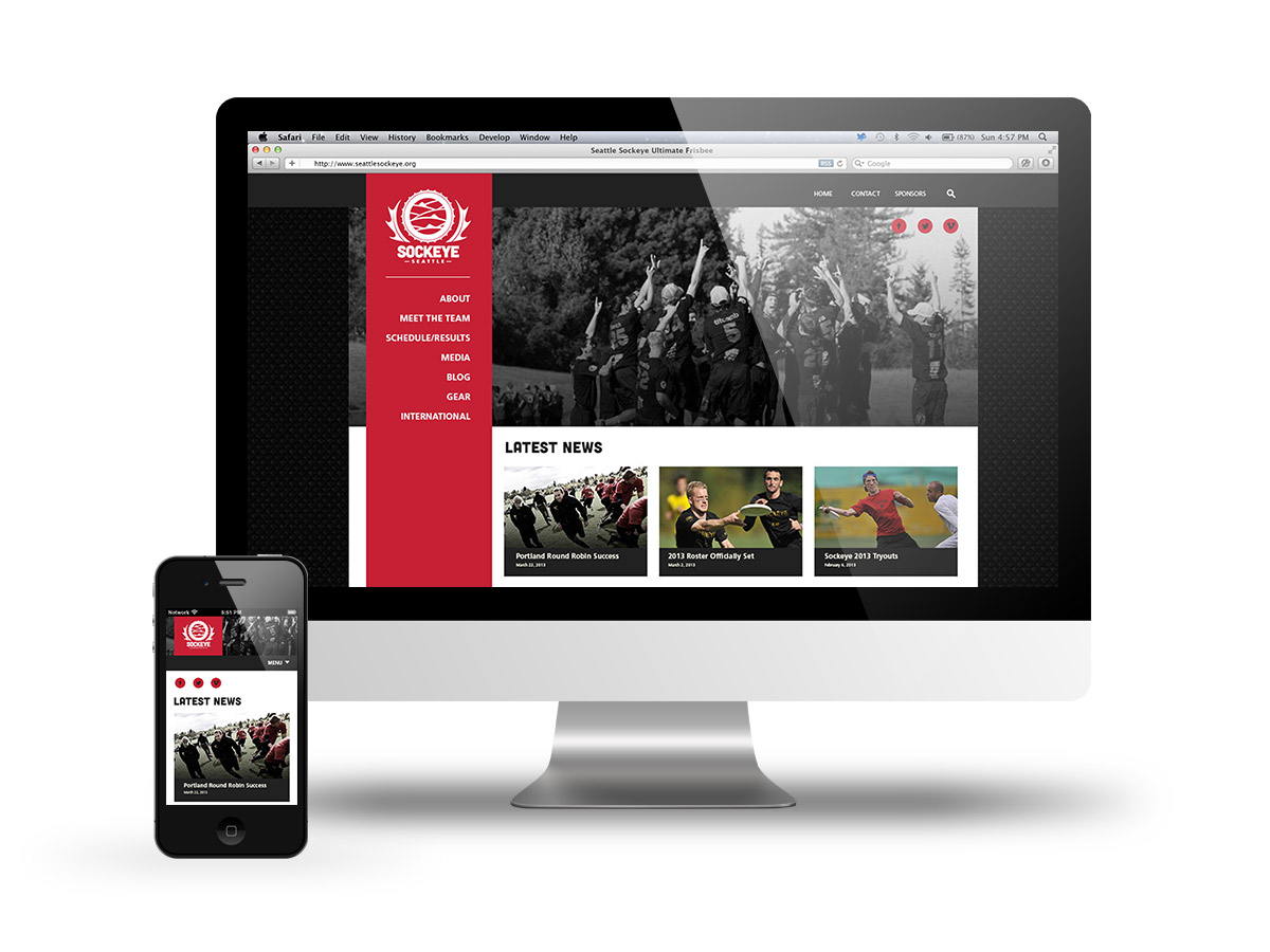
Sockeye Website
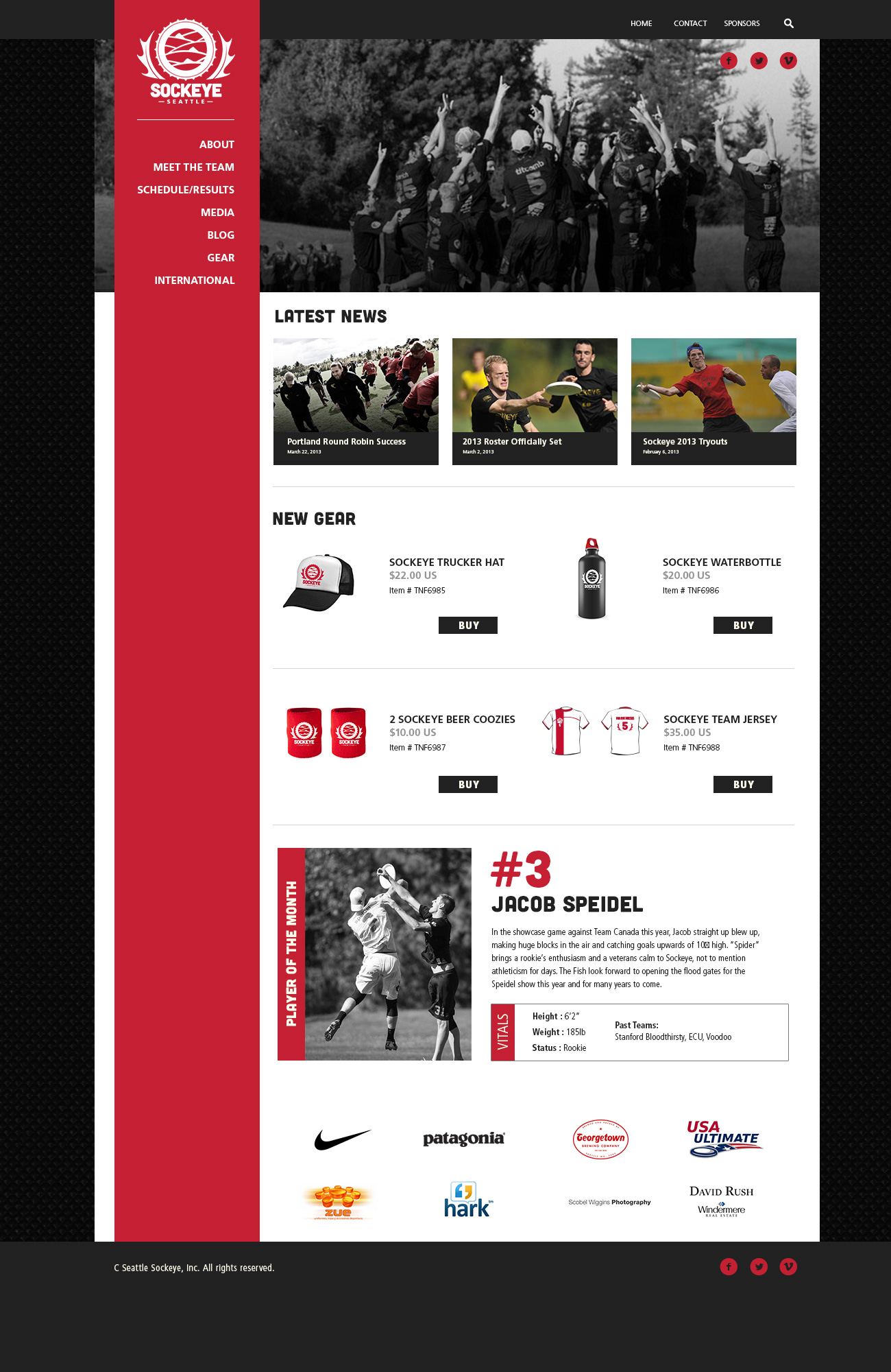
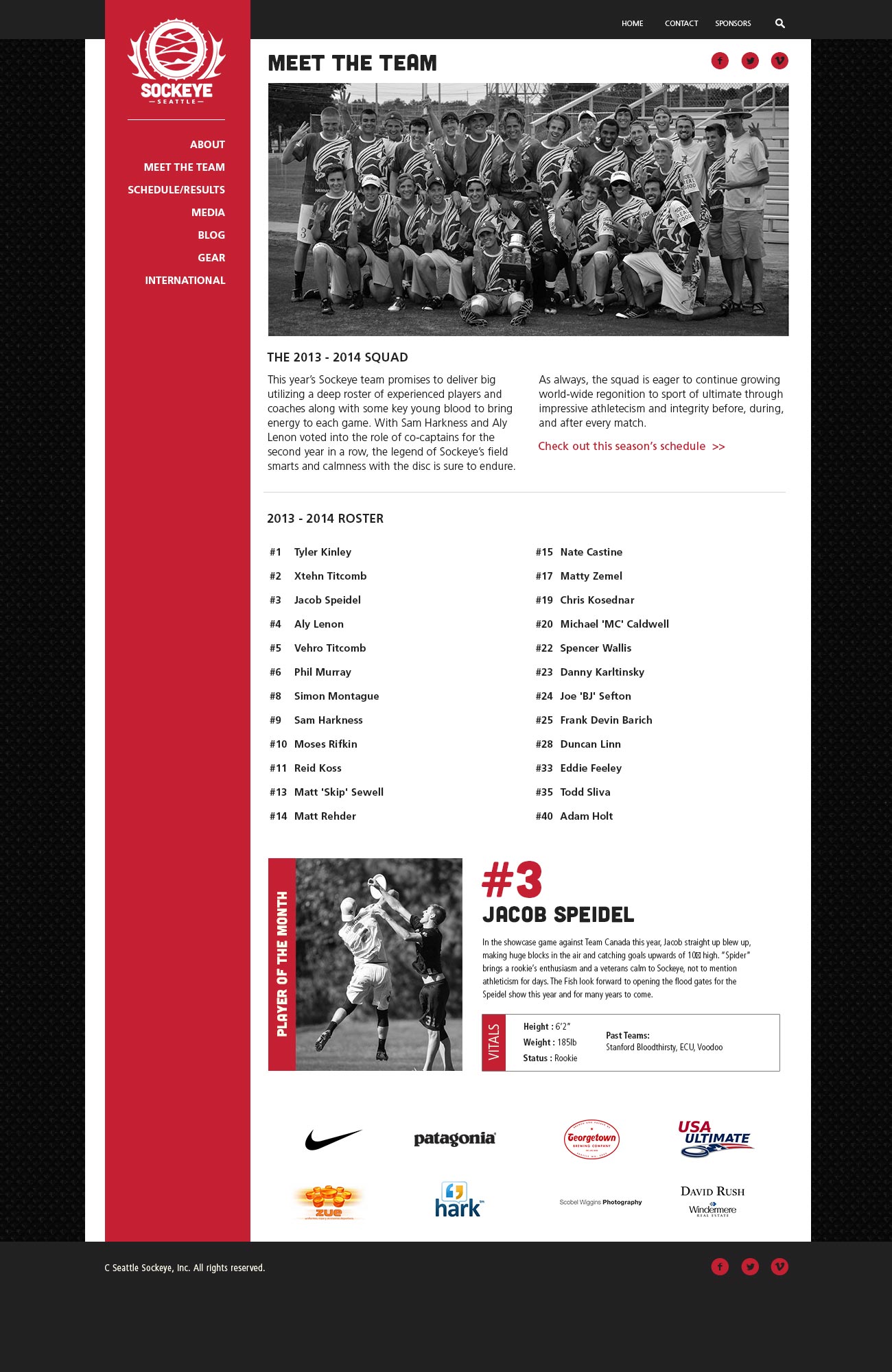
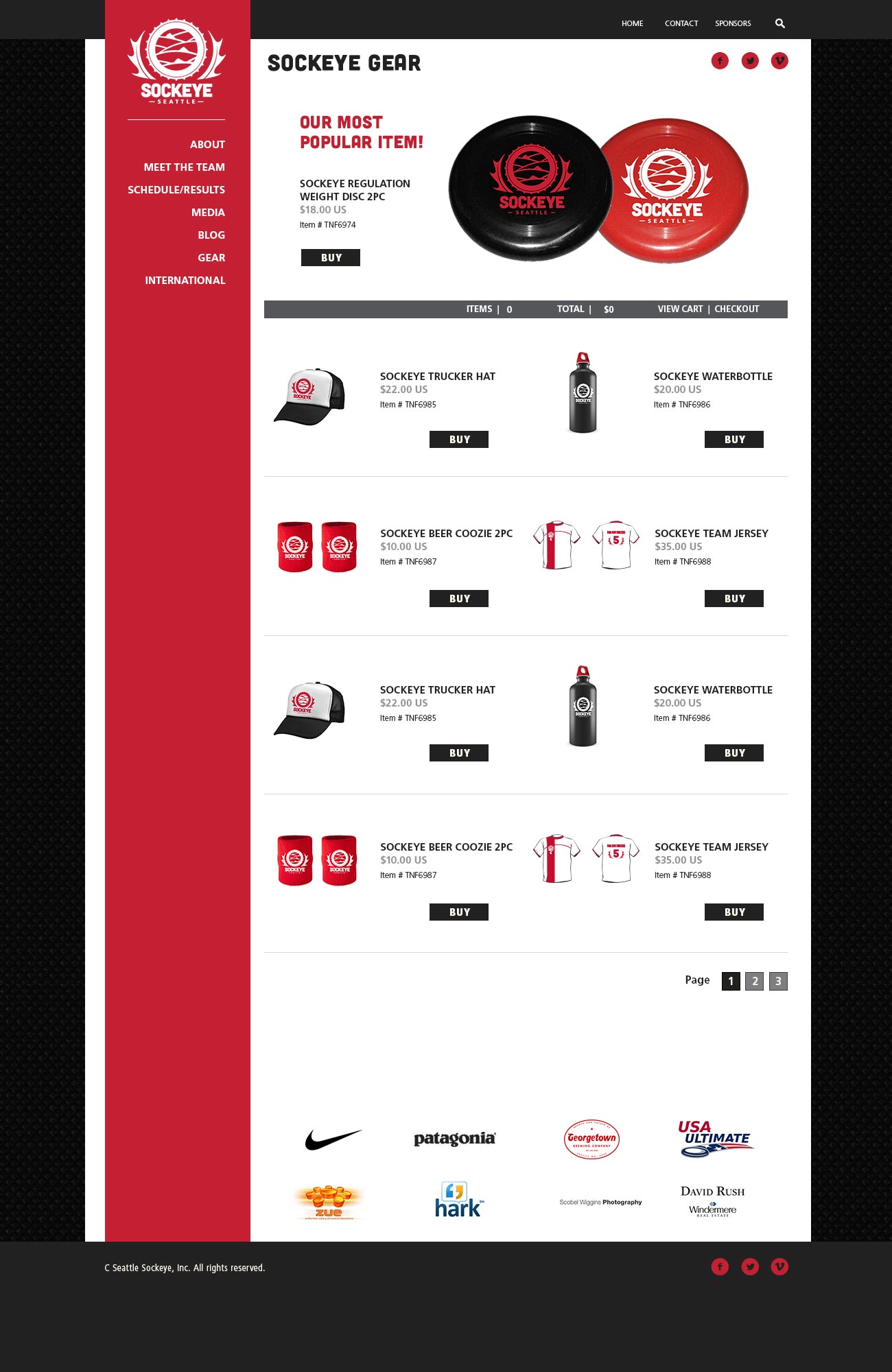
The redesign of the Sockeye website to correspond with the new identity involved creating a more sophisticated navigation system and clean, gridded layout. The side nav stays fixed on desktop for easy access to other pages at any time, and becomes a fixed header on mobile.
The homepage offers a variety of ways to connect with the team, featuring new gear and rotating player bios, and, of course, keeping fans up to date on the latest team news.